
VUE3 ElementPlus Link 链接

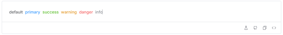
基础用法
基础的文字链接用法。
<template>
  <div>
    <el-link href="https://element-plus.org" target="_blank">default</el-link>
    <el-link type="primary">primary</el-link>
    <el-link type="success">success</el-link>
    <el-link type="warning">warning</el-link>
    <el-link type="danger">danger</el-link>
    <el-link type="info">info</el-link>
  </div>
</template>
<style scoped>
.el-link {
  margin-right: 8px;
}
.el-link .el-icon--right.el-icon {
  vertical-align: text-bottom;
}
</style>
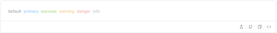
禁用状态
文字链接不可用状态。
<template>
  <div>
    <el-link disabled>default</el-link>
    <el-link type="primary" disabled>primary</el-link>
    <el-link type="success" disabled>success</el-link>
    <el-link type="warning" disabled>warning</el-link>
    <el-link type="danger" disabled>danger</el-link>
    <el-link type="info" disabled>info</el-link>
  </div>
</template>
<style scoped>
.el-link {
  margin-right: 8px;
}
.el-link .el-icon--right.el-icon {
  vertical-align: text-bottom;
}
</style>
下划线
文字链接下划线。

<template>
  <div>
    <el-link :underline="false">Without Underline</el-link>
    <el-link>With Underline</el-link>
  </div>
</template>
<style scoped>
.el-link {
  margin-right: 8px;
}
.el-link .el-icon--right.el-icon {
  vertical-align: text-bottom;
}
</style>
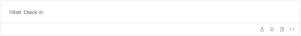
图标
带图标的链接
TIP
使用 icon 属性来为按钮添加图标。 您可以传递组件名称的字符串(提前注册)或组件本身是一个 SVG Vue 组件。 Element Plus 提供了一组图标,您可以在 icon component
<template>
  <div>
    <el-link :icon="Edit">Edit</el-link>
    <el-link>
      Check<el-icon class="el-icon--right"><icon-view /></el-icon>
    </el-link>
  </div>
</template>

<script setup lang="ts">
import { Edit, View as IconView } from '@element-plus/icons-vue'
</script>

<style scoped>
.el-link {
  margin-right: 8px;
}
</style>
Link API
Attributes
| 属性名 | 说明 | 类型 | 默认值 |
|---|---|---|---|
| type | 类型 | enum | default |
| underline | 是否下划线 | boolean | true |
| disabled | 是否禁用状态 | boolean | false |
| href | 原生 href 属性 | string | — |
| target | 同原生 target 属性 | enum | _self |
| icon | 图标组件 | string / Component | — |
Slots
| 插槽名 | 说明 |
|---|---|
| default | 自定义默认内容 |
| icon | 自定义图标组件 |